


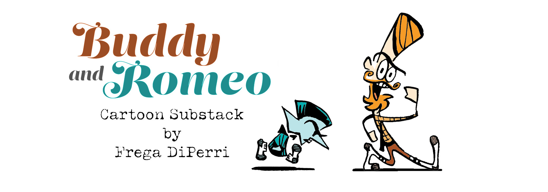
Identity Crisis
How Dunkin' Donuts Disrupted Design Unity with Division
THIS WEEK:
The ongoing and clumsy re-brand of Dunkin’ Donuts
WHERE ARE THEY NOW? Christmas in July + French press cartoons
BEHIND THE PAY WALL:
Complete assessment of the Dunkin’ Donuts visual brand 1950-present
BACK TO THE DRAWING BOARD: Trying to solve the Dunkin’ brand issue
WHAT DO YOU RECOMMEND? An endorsement
The state rests.

This is DiPerri. This week, I’m writing about something that has upset me deeply for the past five years. In 2021, when I reached my boiling point, Frega forbade me from discussing the topic anymore, as my inability to keep my emotions on the subject in check proved to be upsetting. But this weekend, during a family vacation to Maine, old wounds reopened.
Because our hotel was across the street from a Dunkin’ Donuts.
The author, photographed whilst selling prom tickets in April 2012.
I loved the original Dunkin’ Donuts branding and still do. In 2017, Dunkin’ Donuts announced that they would test out abridging their brand name to simply “Dunkin’” in select California locations. I scoffed; believing that dividing their name and beautiful visual iconography that was rich with symbolism and purpose would never work.
I was right that it wouldn’t work but I was wrong that it wouldn’t happen. On September 25, 2018, the company (which fell under the umbrella of parent company “Dunkin’ Brands”) announced that the rebranding would indeed be permanent and take place globally in January 2019.
It happened after all (in some locations) but, for many reasons, it doesn’t work. The Dunkin’ rebrand is a mess.
“Dunkin’” has tried to make the rebrand work in the five and half years that have followed but because of their franchise system, many locations still bear storefronts with the old (beautiful) Dunkin’ Donuts design. A drive down any major interstate might offer you a variety of visual representations of the company, including this one, which we photographed on I-495 in July 2019.
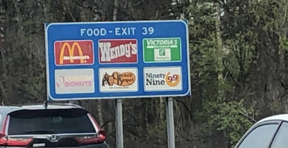
We drove by this same sign just last week and the only updates to it have been from Mother Nature. The coffee cup has vanished entirely; the pale orange Dunkin’ has now faded to a barely visible yellow ghost of the word; and Donuts is now a soft blush pink with a deteriorating, nearly gone “D” and “O.”
“Nuts,” said Dunkin’, crumpling a piece of paper and tossing it past a nearby wastepaper basket.
The fee for a mainline highway sign is between approximately $500 and $2000 per year. We drove by about four of these soon-to-be-blank highway signs, that have all looked even worse than the photo above for the last five years. If each of those signs cost $1000, then the franchisee/s have wasted $20,000 on signs that offer only a glimmer of their former beauty. More on why the highway signs and other billboarding on their buildings present a significant problem for Dunkin’ behind the paywall.
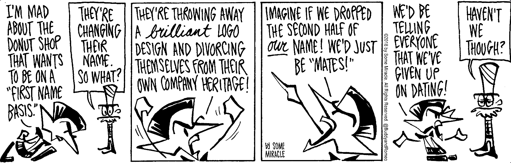
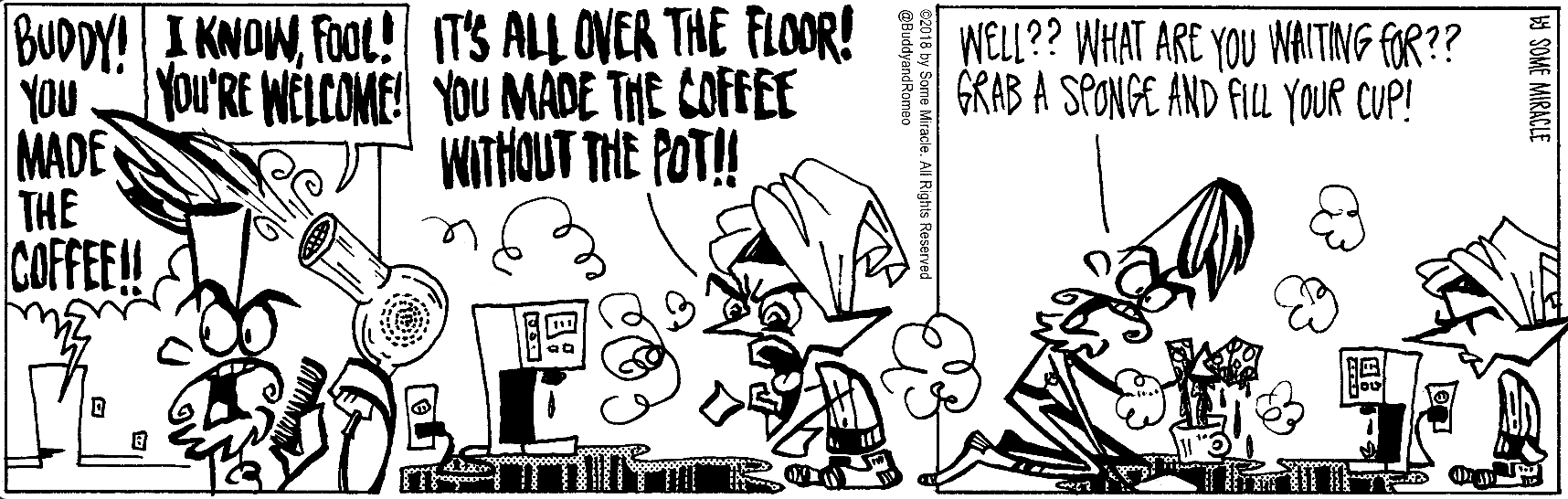
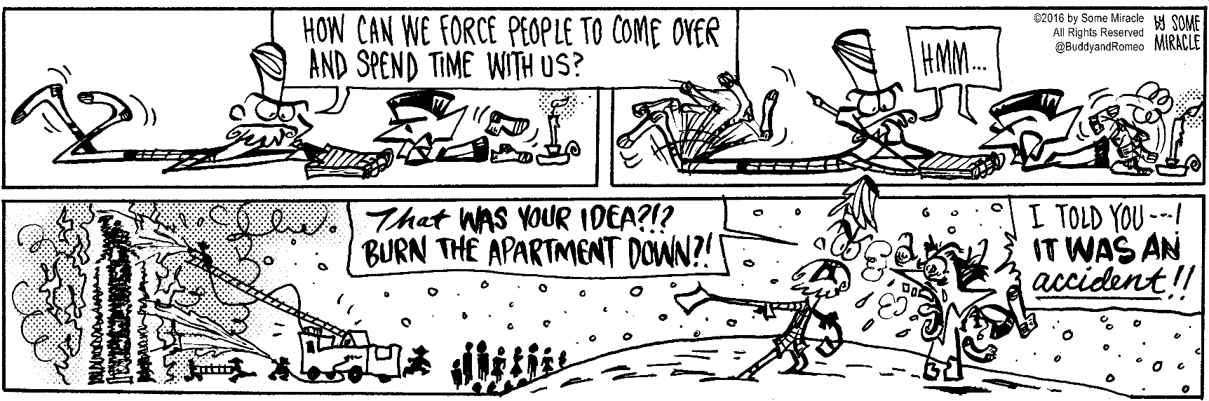
For those who don’t know, in the newspaper, Buddy and Romeo’s comic strip was called Mates and Dates.
The cartoon above was published on October 10, 2018, less than two weeks after the official re-brand was announced. I haven’t warmed to the design since. Chopping off half of a company’s name and visual design is not a wise strategy, even if their intention was to simplify their identity and relationship with the consumer.
What if other companies followed Dunkin’s lead and sliced off half of their their icons?
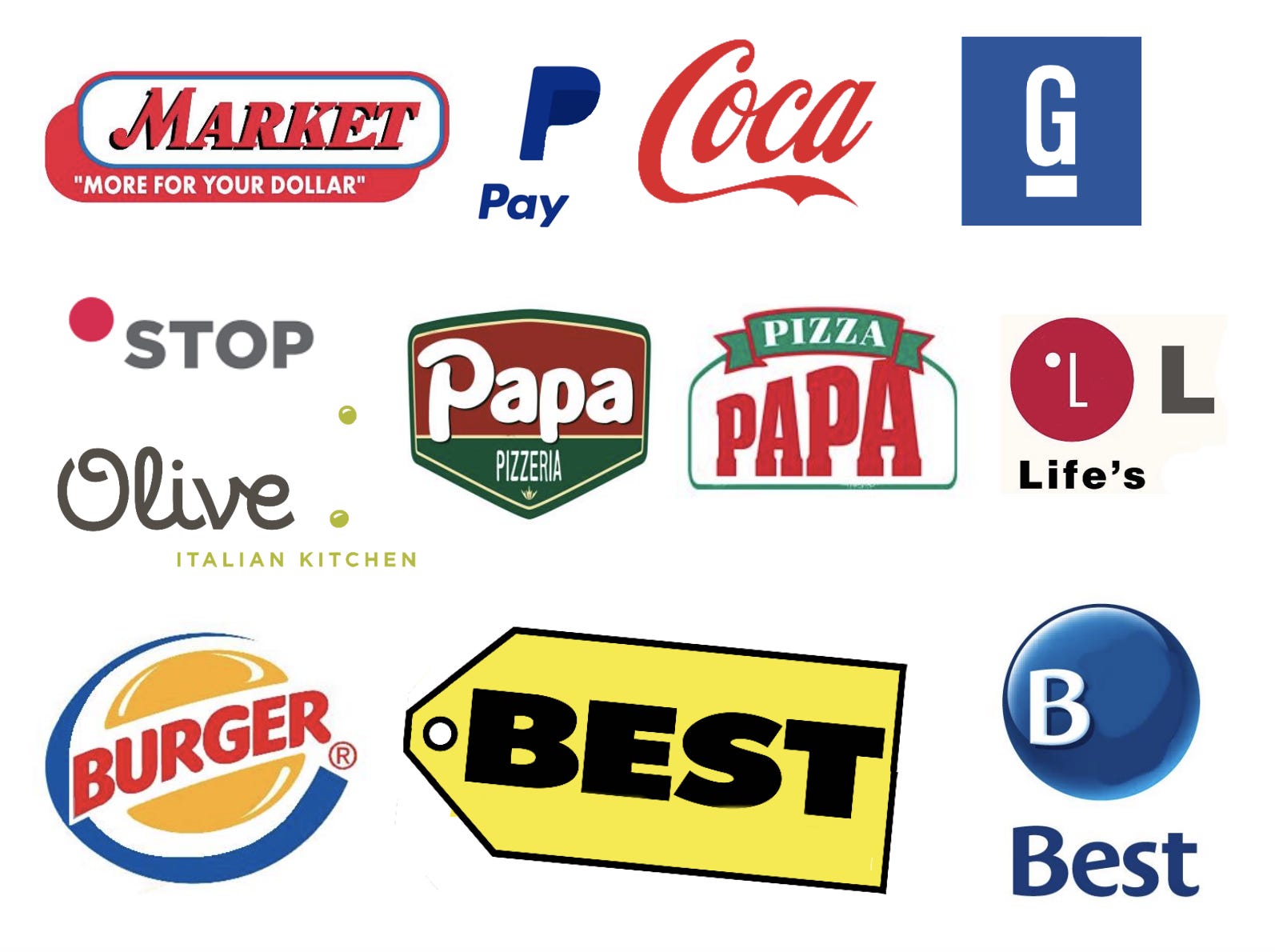
Are most of them still recognizable? Sure. But they feel wrong because they’re missing the rest of their story. The story of their company and the personal stories the consumer has shared with the product and the brand over the years.
TO BE CONTINUED BEHIND THE PAYWALL.
Join us behind the paywall for further visual and audio analysis of the Dunkin’ Donuts icon and the Dunkin’ rebrand.

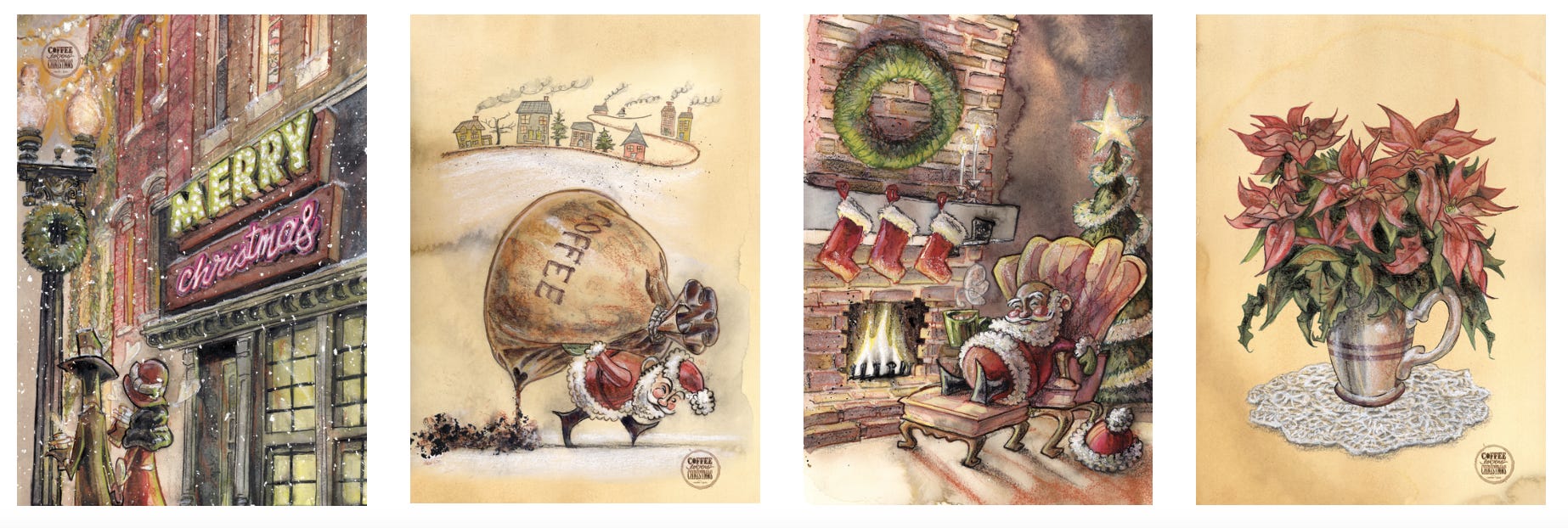
CHRISTMAS IN JULY SALE!
Our Coffee Lovers’ Christmas greeting cards, giclee prints, mugs, and more are all on sale! This is our first ever Christmas in July promo and our best savings of the year. Shop now!

Enjoy 15% OFF orders over $25 + FREE SHIPPING. Use code SUMMERROAST at checkout. Code applies to all shop orders (My Guardian Grandpa books; Buddy and Romeo postcards; Frega DiPerri cartoon mugs; and more). Offer valid now through July 31, 2024 at 11:59 pm EST.
Here are a few coffee cartoons from our CartoonStock catalogue. Like this one from 2020:
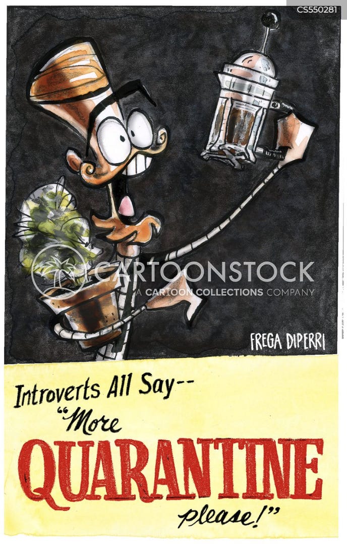
And this one from 2022:
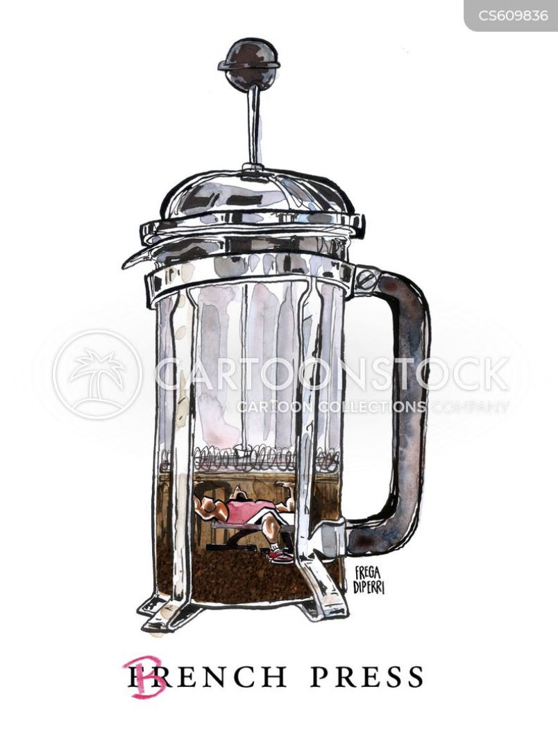
For these and more Frega DiPerri cartoons, visit CartoonStock.
If you’re enjoying yourself at Buddy and Romeo’s expense so far, please consider becoming a paid subscriber. You’ll get exclusive comics and commentaries; behind-the-scenes drawings and project developments; and access to this entire Substack archive. Plus, the more coffee we drink, the more we’ll create.
Keep reading with a 7-day free trial
Subscribe to Buddy and Romeo Cartoon Substack to keep reading this post and get 7 days of free access to the full post archives.